
When a challenge coin design starts to take shape, customers often ask us which plating they should choose. Gold, silver, antique, black nickel, and dual plating can all change the finished look. A detailed badge with small lettering may need more contrast, while a clean logo may look better with a bright polished surface.
In this article, I’ll explain the common challenge coin plating and finish options and show you how to choose one that fits your design.
1. What Do Plating and Finish Mean on a Challenge Coin?
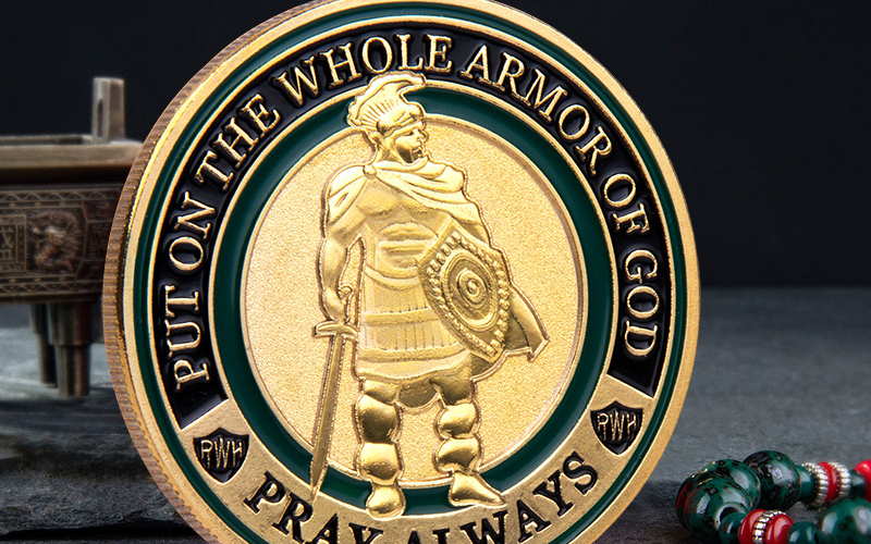
Plating determines the visible metal color, such as gold, silver, copper, or black nickel. Finish describes how that plated surface looks, such as polished, antique, satin, matte, or sandblasted. Neither one is the same as the base metal, such as brass, zinc alloy, or iron.
A polished gold coin catches the light and looks bright. An antique gold coin has darker recessed areas, so the raised badge and lettering stand out more clearly. A sandblasted background reduces reflection and adds contrast behind polished details.
This distinction matters when you approve the artwork. The same logo can look completely different with a polished finish instead of an antique one. That is why we confirm the plating with the proof, rather than treating it as a last-minute color choice.
2. Common Challenge Coin Plating Options
The right plating depends on the artwork. We look at the details, enamel colors, text, and overall style before recommending the option that fits the design.
| Option | Best For | Main Benefit | Watch Out For |
|---|---|---|---|
| Polished | Simple logos and presentation coins | Bright, reflective surface | Small text, fingerprints, and light marks |
| Antique | Badges, crests, and detailed artwork | Stronger relief contrast | Darker overall appearance |
| Black Nickel | Bright enamel colors | Dark metallic contrast | Dark-on-dark details |
| Black Metal | Bold, modern artwork | Solid, darker appearance | Needs light colors for contrast |
| Dual Plating | Highlighting one emblem | Two metal colors | Requires clearly separated areas |
| Sandblasted, Satin, or Matte | Reducing glare in selected areas | Quieter background and clearer contrast | Placement must be shown on the proof |
| Rainbow | Creative and mascot designs | Natural color variation | Exact color placement cannot be matched |
Polished Gold, Silver, and Copper
Polished plating has a bright, reflective surface. Gold gives a coin a warm and formal look. Silver feels cleaner and more modern, while copper has a warmer, less common tone.
This finish works well for simple logos, presentation coins, and designs where the metal itself is part of the look. If the artwork has a lot of small lettering or shallow 3D detail, however, reflected light can make those areas less clear. In that case, we may add dark enamel or a sandblasted background to create more contrast.
High-polished finishes show fingerprints and light surface marks more easily, while antique finishes usually make minor wear less noticeable.
Antique Gold, Silver, and Copper
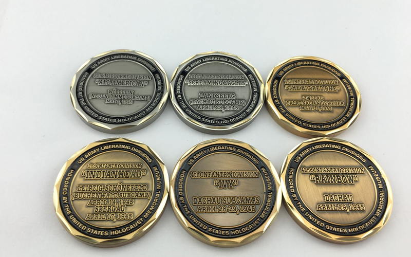
Antique plating does more than make a coin look older. The recessed areas are darkened, so the raised metal, text, and borders are easier to see.
It is a practical choice for police badges, military crests, anniversary coins, and designs with dates, mottos, or many fine lines. When a customer’s artwork has a lot of detail, we often recommend an antique finish first. The coin can still look clear even without much color fill.
Black Nickel
Black nickel has a dark gunmetal shine. It is not solid black, so it still keeps a metallic look.
It works especially well with bright enamel colors. White, red, blue, and other light colors stand out clearly against the dark metal. For a dark metal-only design, we need to check the proof carefully because some recessed details may not be easy to see.
Black Metal
Black metal looks quite different from black nickel. It is darker and usually has a more matte appearance instead of a metallic shine.
This option needs clear contrast in the artwork. Light enamel colors or larger bright areas work well. A black-metal coin with only small dark details can be difficult to read under normal light, so it should be chosen for the design, not simply because black looks good.
3. How PinsFun Recommends the Right Plating?
At PinsFun, we usually discuss the plating color at the quotation stage. Once a customer sends us their design, we review the artwork and recommend a suitable plating color based on its details, enamel colors, text, and overall style.
Sometimes the choice is straightforward. A simple corporate coin may suit polished silver, while a department badge with small lettering may need an antique finish. If two options could both work, we can show them in the proof and help the customer compare the final look.
We confirm the plating with the artwork proof, before production starts. This avoids a situation where the customer expects a bright, polished coin but receives a darker, vintage-style finish instead.
4. Specialty Challenge Coin Finish Options
Most challenge coins only need one plating color. Specialty finishes are useful when the design needs stronger contrast, a clear focal point, or a less traditional metal look.
Dual Plating
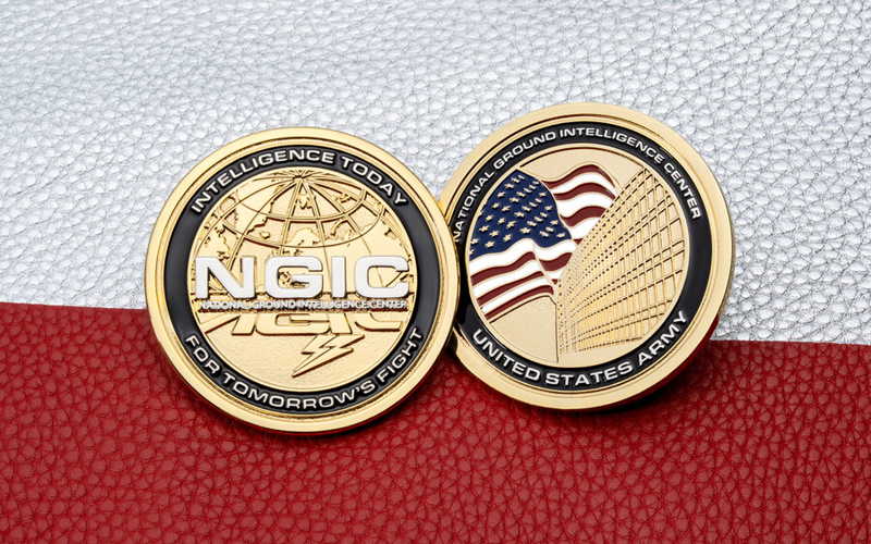
Dual plating is used most often on military and police challenge coins. It adds a second plating color to a particular part of the design, usually a badge, seal, border, or special logo.
When a customer wants one emblem to stand out from the rest of the coin, dual plating is one way to do it. Before we recommend it, we check whether the artwork has clear metal areas for the two plating colors.
Sandblasting, Satin, and Matte Surfaces
These surface effects do not change the main plating color. They change the way light reflects from the coin.
For example, a sandblasted recessed background can make polished raised metal stand out more clearly. Satin and matte surfaces are less reflective, so they suit designs that need a quieter metal look. For a coin with deep 3D relief, we check the artwork before adding these effects, because the surface treatment must still support the details.
Rainbow Plating
Rainbow plating gives the whole coin a rainbow-colored metal finish, rather than placing fixed colors in separate areas of the design. Because the coins are plated in a plating bath, no two pieces come out exactly the same. Each coin has rainbow tones, but the color at one particular spot may be different from coin to coin.
This finish suits creative artwork, event coins, and mascot designs that do not need a traditional gold or silver look. It is not suitable when the customer needs exact metal-color placement. We make rainbow-plated coins less often and normally recommend it only when this natural variation is part of the intended design.
5. Conclusion
The right plating should keep the artwork clear and match the intended look.
Send us your design with the quote request, and we can recommend a plating direction before preparing the proof.
6. Frequently Asked Questions
Can I Mix Polished and Antique Plating on One Coin?
Normally, no. For dual plating, use two colors from the same finish family, such as polished gold with polished silver or antique gold with antique silver.
Can I Use Enamel Colors With Antique Plating?
Yes. Antique plating can be paired with enamel colors to keep the metal details clear while adding color to the design.
Does Sandblasting Work on Deep 3D Relief?
Usually, we place sandblasting on flat or recessed backgrounds rather than on the highest 3D details. We confirm the placement on the proof so the relief remains clear.