When customers design a custom medal, they often start with a logo, event name, or a rough idea. The important part is turning that idea into a design that looks clear on the finished medal. In this guide, I will explain how to plan the artwork step by step.
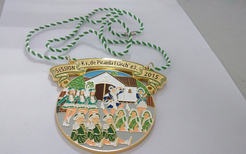
1. Start With the Medal’s Purpose and Main Message
Before choosing a shape or color, decide what the medal is meant to represent. We make medals for many different occasions. A race medal needs a different look from a school competition medal. Company awards and station anniversary medals also need their own design.
Choose one main message for the design. It may be the event, the achievement, a local landmark, or the organization behind it. Once that is clear, it is much easier to decide what deserves the most space on the front of the medal.
2. Build the Front Design Around One Main Visual
Choose the Main Image, Logo, or Event Title
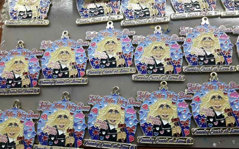
The front should be understood in a few seconds. Start with the image that best represents the event, such as the event logo, a mascot, a runner, a school emblem, or a landmark. The event title can support that image, but it should not compete with it.
For a medal with a strong logo, the logo can be the main visual. For an event with no established logo, a clear symbol often works better than a collection of unrelated icons.
Do Not Crowd the Front With Too Much Information
A common design mistake is trying to put the event title, date, distance, sponsor logos, location, slogan, and several graphics on the front. The medal may look busy in a digital proof, and the small details become harder to read after production.
Keep the front focused. Information that is useful but not essential to the first impression can move to the back of the medal.
3. Match the Medal Size and Shape to the Artwork
Choose a Shape That Supports the Design
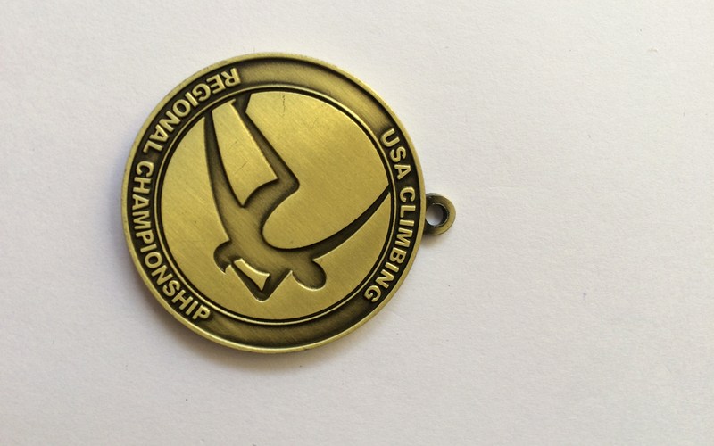
A round medal works well for badges, seals, and centered event logos. A custom outline can add value when the shape is part of the story, such as a building, animal, state, mascot, or piece of sports equipment. Do not choose an irregular shape only to make the medal look different; it should help the main artwork read more clearly.
Keep Text, Lines, and Color Areas Clear at the Actual Medal Size
The amount of detail a medal can carry depends on its actual size. Before confirming the artwork, print it at a 1:1 scale. If the logo and small text are clear on the printout, they are much more likely to be clear on the finished medal. If they cannot be read or printed clearly, the same problem will appear in production.
Do not force a complex design into a small medal. A simple logo can work at 1.5, 1.75, or 2 inches. If the design also includes an event name, date, sponsor logo, or small text, 2.5 or 3 inches is usually a better starting point. As a practical starting point, keep the smallest enamel area at about 2 mm. The final limit depends on its shape and the surrounding metal lines, so confirm it on the artwork proof.
4. Decide What Belongs on the Back of the Medal
The front and back do not need to repeat the same design. Use the front for the main visual and the back for supporting information, such as the event date, location, sponsor logos, distance, category, or a short message.
This gives the design more room to breathe. It also keeps important text readable without making the front look like a notice board.
5. Use Color and Metal Contrast to Make the Design Clear
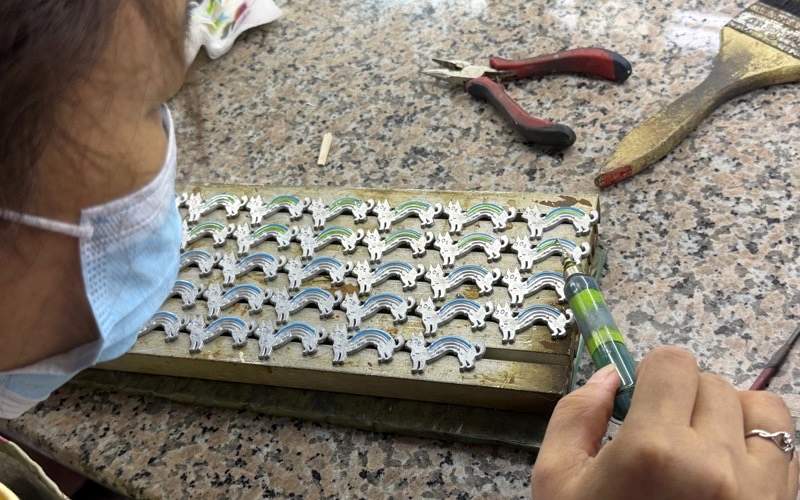
Color should help the viewer find the important parts of the medal. Use brand or event colors where they strengthen the main image, and leave enough metal line between color areas so the artwork does not blend together.
The plating should also suit the design. Bright colors usually need a metal finish that gives them contrast, while a detailed metal-only design may read better with an antique finish. Review the artwork as a whole instead of choosing colors and plating separately.
For school competitions in the U.S., we normally use gold, silver, and bronze finishes for first, second, and third place. For marathon medals, gold and silver are more common.
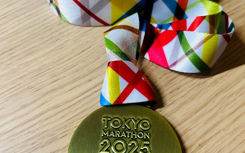
Plan the ribbon and attachment with the medal, especially when the ribbon uses custom colors or printing. Confirm the ribbon width, color, and connection method before approving the proof so they work with the medal’s size and shape.
6. Turn Your Idea Into a Production-Ready Medal Design
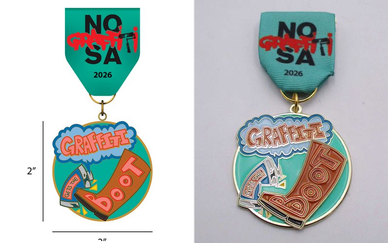
You do not need to begin with finished medal artwork. Send PinsFun your logo, sketch, reference images, event details, required text, and any colors you want to use. A clear idea is enough to start the discussion.
| What to Provide | Details |
|---|---|
| Project Purpose | Event type and main message |
| Logo or Reference | Logo, sketch, or inspiration image |
| Required Text | Event name, date, distance, or award category |
| Size and Shape | Preferred dimensions and outline, if known |
| Colors | Brand colors or Pantone references |
| Front and Back | Information required on each side |
| Ribbon | Color, width, printing, and attachment requirements |
We then help turn those materials into a production-ready proof. Before the mold is made, check the spelling, dates, logo placement, colors, and small details at the intended medal size. This is the point where changes are easiest to make.
7. Conclusion
A good custom medal design has one clear main idea, enough room for its important details, and a layout that suits the real size of the medal. Start with the purpose, keep the front focused, use the back for supporting information, and review the production proof carefully before approval.
8. Frequently Asked Questions
Can I Design a Custom Medal From Just a Logo?
Yes. Send the logo with the event name, date, and any style references, and we can build the medal artwork around it.
What File Should I Send for a Custom Medal Design?
An AI, PDF, or SVG logo is best, but a clear PNG, JPG, sketch, or reference image can also be used to begin the artwork proof.